
Portfolio URL: https://phoebeackor.dreamhosters.com/portfolio/
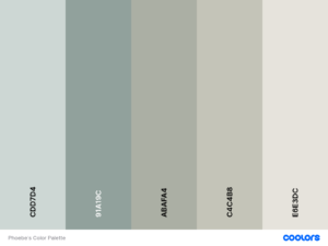
Color Palette: I chose this arrangement of colors for my color palette because I’m typically drawn to muted colors as well as shades of blue, green, and taupe. It feels elegant and mature.
Logo: I designed this logo in the way that I did because one of the ways I practice my creativity in my personal life is through calligraphy, writing letters, and making cards. I wanted to play around with the visual of a handwritten letter that has a stamp and a font that resembled my actual handwriting. For the stamp I added a cluster of blueberries because the real ones I use in my day to day have a similar design.
![]()
Code Pen: