Working color palette:
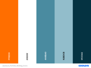
I picked these colors because blues generally communicate trust, reliability, and technological advancement in graphic design. I picked the dark blue for the background and white for the smallest text because white-on-dark is generally easier on the eyes than dark-on-white. That bright orange is good for accents, buttons, highlighted text and go on, because it’s a striking complement to the more muted blues and thus stands out without looking too strange. I may tweak the palette in the future if I find better combinations.
Fonts I chose: Goldman for the largest headings and titles, and Kanit for everything else.
Goldman looks good in boldface, has a futuristic feel without appearing pretentious, and brings to mind the graphic design from video games published in the 2000s and early 2010s. I feel like that’s the perfect combination for a digital design and art portfolio, clean, expressive and fun at the same time. Kanit has a similar “attitude” as Goldman, but it’s slimmer, so it’s a little easier to read in small font sizes.