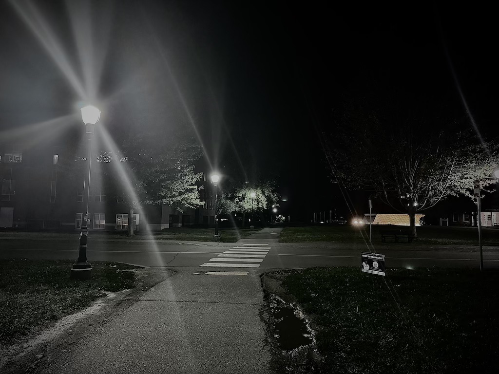
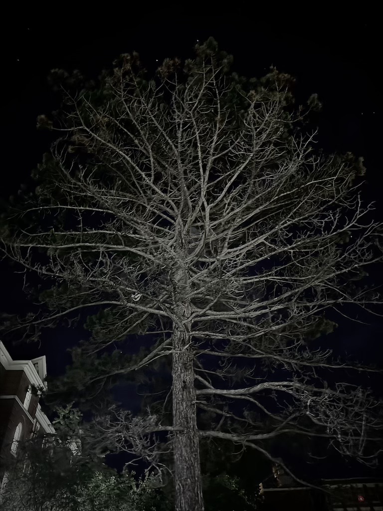
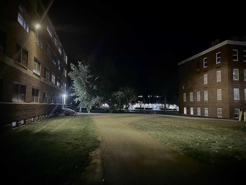
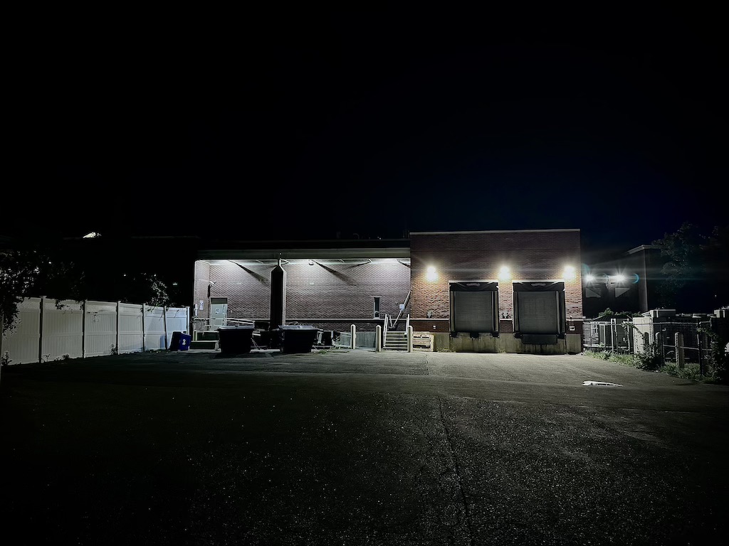
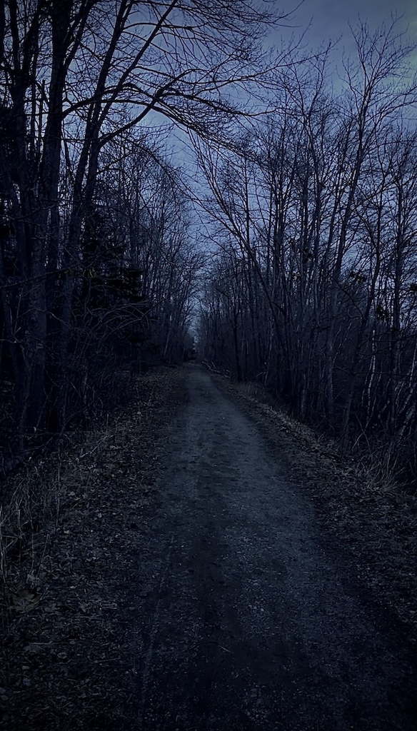
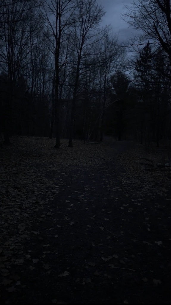
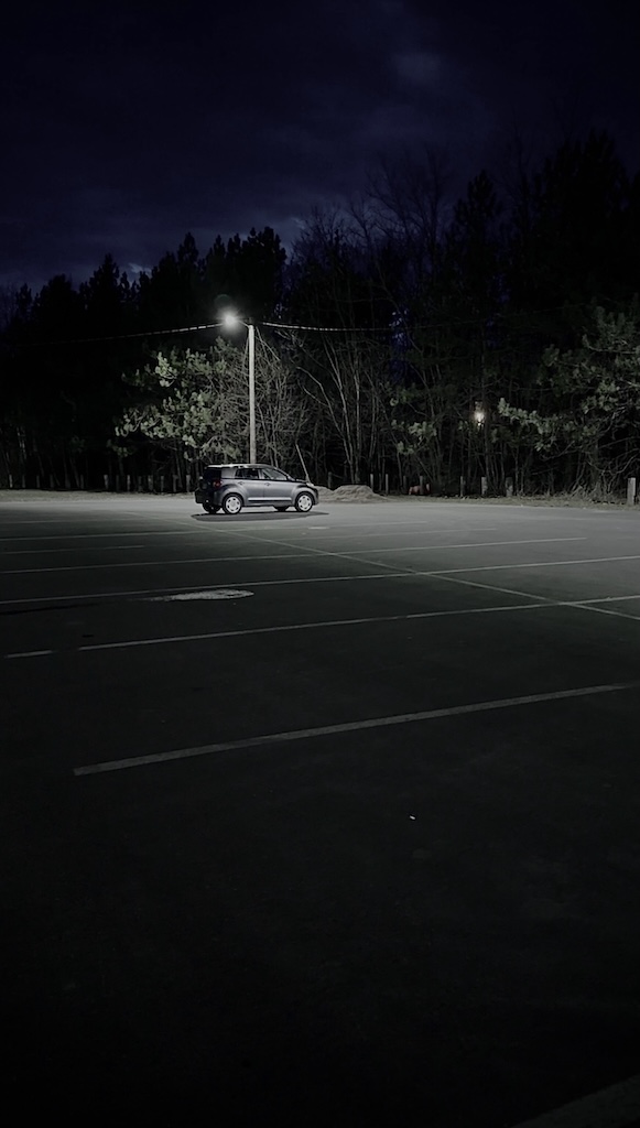
All photos taken at UMaine.

Student reflection for a previous project:

 Phoebe Ackor

Photos

  • What’s working?–why? I really like her use of a black-and-white theme. It gives it an eerie vibe. It is sort of a “pretty historical horror” vibe. I think her use of light/shadows and windows was a cool touch.
  • What would you change/improve? why? Ironically, the things I liked are also the things I question. The story seems very eerie and a bit creepy due to how dark the photos are, but I am not sure if that was the vibe she was going for or not. The wording in the story is also eerie, but it is not fully written to be creepy, so I do question the vibe a little bit. I also think there are a few photos that are a little hard to see what is going on due to harsh shadows. For example, the window shadows.

Story

  • What’s working?–why? The story itself is very well-written. I like the memories used, the way the photos are described, and what they mean to the author. I also like how there is a poetry element to some of the paragraphs.
  • What would you change/improve? why? Again, as before, the vibe is a little bit hard to read, in my opinion. I am not sure if this is meant to be a little creepy, somber, etc. The story talks about peace and comfort, but the visuals appear to be dark and completely desaturated. I think it is a little confusing in that aspect.

Layout/design

  • What’s working?–why? The color scheme is all very linear, which I appreciate. It all blends very well, and the fonts are very on par with the vibe. My favorite parts are Otto’s corner and the family dinner slide.
  • What would you change/improve? why? I wouldn’t change much, but I do think a couple of areas are slightly busy. The willow tree part comes to mind. I wouldn’t have overlapped the text with the window photo. I might’ve put the text underneath it instead, since the window is very grid-like and can make the text seem slightly asymmetrical or busy. Other than that, I think this was a very good story.
Peer reflection: Comparison in the day vs. night, example: “During the day, this place is crowded, but at night it’s empty.” Try to use photos with no people in it. Stay away from gore, but fictionalize someone who feels crazy at night due to their loneliness.
1D Final Link:
Something I would try next time: I decided not to do the day vs. night comparison photos because I wanted to keep the eerie/horror vibe for the entire project and wanted it to fit the dark theme. As a sequel or similar project to this, I could take the same photos from the same place during the day and do a comparison of them, but I decided against it for this project since the daytime photos were off balance with the eerie vibe of the template. Favorite photo is featured image.

Leave a Reply

Got a question? Need Help?
Have a suggestion?

Send a message